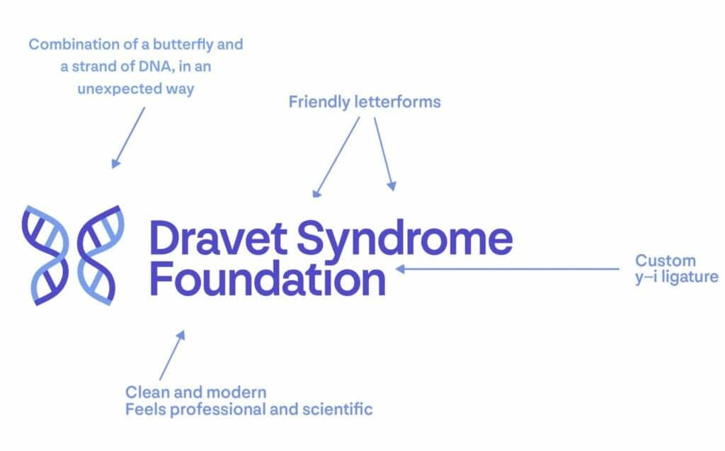
After twelve years, DSF is releasing an updated brand identity, which includes a new logo, colors, and font. We have refreshed our logo to reflect who we are today and to symbolize our future. We believe the new look reflects the Foundation’s growth since 2009 and emulates our large scope of work, including research, awareness, and patient support. During the month of June, you will begin to see our new look anywhere we’re out in public – like our website, social media channels, and merchandise – very soon.
We worked closely with a designer to create a new logo mark that reflects a professional and established look representing our disease state, particularly the genetic component. The concept for the new logo was to combine the idea of a butterfly and a strand of DNA in an unexpected way. The butterfly is from our original logo, which symbolizes hope. And the DNA represents the genetic component of Dravet syndrome, as well as the Foundation’s focus on the advancement of science and research. We feel that our new logo feels empowering, optimistic, connected, and structured, and that our new typography and logo colors are clean, modern, and elevated, but with a warm and friendly feel.
Our new logo encompasses the many achievements of the foundation over the past 12 years. We believe that it refocuses our existing messaging to better connect with our community stakeholders and explains who we are, why our organization is so valuable, and what we have to offer.


